")
In this post, 3 components are to be introduced. They are respectively hotspot component, gauge component and waveform component. With the explanation of each component property, followed by a simple example, I believe you’ll quickly learn to use these components to design complex interfaces.
Hotspot Component
The hotspot component is used to create a detectable touch area. The hotspot attribute table is very simple, there are just 6 properties. With just a look, you’ll get their meanings, not to mention the explanation note below the table.

You can design a hotspot to execute events when touching release. For example, design two hotspots, by touch releasing one hotspot, the page loads the next image, by touch releasing another, the page loads the last image. This realizes the image browsing effect that we often use.
Example:(Download hotspot example here)
Firstly, choose an image to be your background, we choose picture 0 here. Create a font. Then add two text components, we are going to make them indicating arrows. Below are the settings:


Next, add two hotspot components to the background, drag and drop them to the desired area. Add another picture to the picture library. Then set the table cells as follows:


Finally, select hotspot m0, then move on to the compiler window, select touch release event and input page0.pic=0 in User Code, as shown below. Similarly, select hotspot m1 and inputpage0.pic=1 in User Code.

Compile and debug, you can click the left part or the right part of the image in the simulator. If everything is ok, you will successfully switch between the two background images. Effect demonstration video is at the end of this post.
Gauge Component
A gauge component is used to create a pointer, which is widely used in gauges.
Let’s first learn about its attribute table.
| PROPERTY NAME | EXPLANATION |
| objname | Component name, double click it to rename |
| vscope | local: current page |
| global: a variable can be applied to other components on any page | |
| sta | solid color: solid color background |
| crop image: crop background image to achieve the transparent effect | |
| bco | Background color |
| val | Initial angle(0-360) |
| wid | The thickness of the pointer, maximum: 5 |
| pc0 | Pointer color |
| x | Coordinate X |
| y | Coordinate Y |
| w | Component width, when dragging the component sideline to change the width, it gets changed accordingly |
| h | Component height, when dragging the component sideline to change the height, it gets changed accordingly |
Example:(Download the example here)
We are going to make a pointer whose angle can be adjusted by two buttons. So we’ll need one gauge component and two-button components. Here we go.
First of all, choose a picture to be our background. Then add a pointer component in the display area, drag and drop it to the desired position. And adjust the width and length by dragging the side line or by inputting w and h.
Here we set the component attribute table as follows:


Next, add two button components. The properties are set as below:


This is how the display window hopefully looks like:

You can see the example demonstration video at the end of this post.
Waveform Component
Waveform component is used to create a series of waveforms that can detect all kinds of hardware working status.
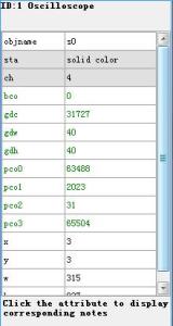
Below is the waveform component attribute table:
| PROPERTY NAME | EXPLANATION |
| objname | Component name, double click it to rename |
| sta | crop image: crop background image to achieve the transparent effect |
| solid color: solid color background | |
| image: component background is image | |
| ch | Number of channels, from 1 to 4 |
| bco | Background color |
| pic | Background image |
| picc | Background crop image(must be a full-screen image) |
| pco0 | The foreground color of Channel 0 |
| pco1 | The foreground color of Channel 1 |
| pco2 | The foreground color of Channel 2 |
| pco3 | The foreground color of Channel 3 |
| gdc | Grid color |
| gdw | Grid width (0=none) |
| gdh | Grid height(0=none) |
| X | Coordinate X |
| Y | Coordinate Y |
| W | Component width, when dragging the component sideline to change the width, it gets changed accordingly |
| H | Component height, when dragging the component side line to change the height, it gets changed accordingly |
Example:(Download this example from here)
In this example, we create a four-channel waveform component. The channels are in different colors. Below are the settings:
Following picture is the how the waveform look like, download the source code, let mega2560 continuously output 4 channel value to plot the curves. The demonstration video is at the end:

Demonstration Video
The three examples’ effect can be demonstrated by the below video:

